My Work.

Depersonalisation/ Derealisation Disorder

The aim of this project was to raise awareness of Depersonalisation/Derealisation disorder (DPDR). DPDR is a mental health condition which affects around 2% of the UK's population. Symptoms include feeling detached from yourself and your surroundings; feeling like you're in a dream-like state, and feeling as though time is distorted. The condition is often left undiagnosed due to lack of awareness, making it difficult for sufferers to get help.

Within this project I wanted to create a short animation which highlights the most common symptoms of DPDR, in order to raise awareness for the condition. mental health is a topic I like to address within my projects as I think it is important to create awareness for something which affects so many people. I think creating visual representations of some mental health conditions helps others to understand what people may be feeling, and moving image is a really powerful way to do this in modern day. With the rise of Social Media platforms such as YouTube and Facebook, it is a great opportunity to raise awareness for social issues such as this.

This project was my first time working with rotoscope animation, and with Adobe Animate. It was a challenge to combine my film and animation skills to create a rotoscope animation frame-by-frame. Despite the challenge, I was driven by the desire to raise awareness for DPDR, as well as having the motivation to push myself to learn something new. I am so pleased with the outcome of this video, I think it holds a powerful meaning and represents the issue in a respectful manner. The utilisation of animation to highlight the sense of altered reality works really well in this piece. This was one of my first tastes of Motion Graphics, and I learned that this was an area of design I am extremely interested in, and would love to work with more in the future.

MalesAllowed CIC

MalesAllowed CIC are a not-for-profit men's mental health organisation in Plymouth, Devon. It was set up by Paul Thompson, an advocate for men's mental health, when he wanted to create a community for men who may be struggling.

Working with MalesAllowed CIC on a promotional campaign was one of the most exciting and rewarding projects I've ever been a part of. I was given the opportunity to create a range of content for their Social Media channels. This was a great chance for me to work towards a real-life cause here in Plymouth.

One of the pieces of content I created for MalesAllowed was a motion graphics piece, highlighting men's mental health struggles. I wanted to show that mental and physical health are just as important as each other, and that men don't always have to carry their problems alone. I created this message by turning physical weight into a metaphor for the mental weight stress can cause.

As well as creating a motion graphics piece, I created a variety of posters for their Instagram, which needed a touch of modernisation and fresh content. I incorporated the video campaign, as well as creating some posters with facts about men's mental health. I also created a new cover image to give their Facebook and Twitter pages a new life, and an uplifting touch of colour.

Penguin Book Cover - Norwegian Wood

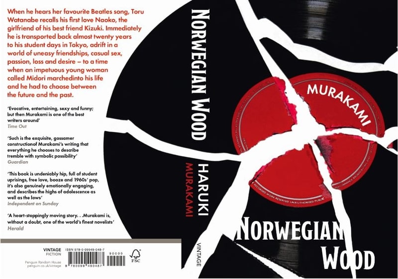
As part of Penguin's Book Cover competition, I challenged myself to create a book cover for Haruki Murakami's 'Norwegian Wood'. This was an interesting project for me as I was just delving into the worlds of Adobe Illustrator and InDesign. I used my skills with Photography to create a cover which showed an object I found to be very prominent within the book - a record.

There was a theme of mental health running throughout the book, which is something I love to incorporate within my projects - I think it's something important to highlight when I can. I used the record as a metaphor for the themes of mental health within the book, displaying a broken record to suggest that something has been damaged within the storyline.

Incorporating typography within the book cover was something I found to be a challenge, as I hadn't worked with type often in the past. This was an opportunity for me to explore the world of typography, and understand how to place text on a book cover. I believe I managed to make the text work well with the broken record image, with the title and author almost becoming part of the record, and the blurb wrapped around the curve of the record.

'The Art of Free Will' - Zine

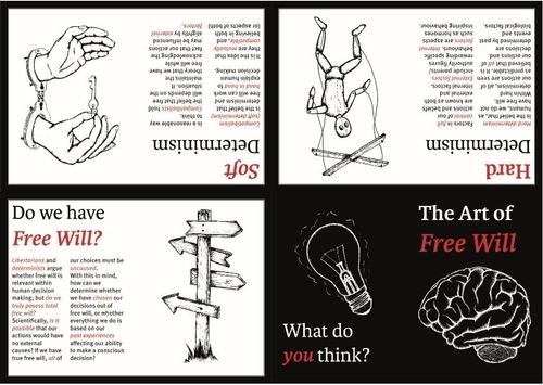
This was a project which challenged my use of layout, typography, and illustration. I was required to create a zine based around the theme 'hard & soft' - I decided to create a theme exploring free will (hard & soft determinism). I wanted to push myself to create hand-drawn digital illustrations, as I hadn't worked with digital illustrations in the past. I aimed to come up with visual representations of the concepts I was writing about in my zine, really experimenting with the 'art' of free will (hence the title of the zine).

I used a simple red, white, and black colour pallette in order to place emphasis on the information and illustrations - highlighting key aspects of text in red, showing the reader which information is of importance. It was key that, in the zine, the illustrations held significance, therefore, I made sure they took up a page each. The combination of type and image was extremely important in this project, and gave me space to explore how they interact with each other.

Contact form

Fields marked with an asterisk (*) are required.
Thank you! Your submission has been received!
Oops! Something went wrong while submitting the form.